
Section 3: PERSPECTIVE. Exercise 3

Aerial Perspective

This was easy for me to do as the high amount of moisture in the air here lends itself to this. All the views are done from my balcony.
 Ink and wash


Charcoal study. I felt that I achieved the feeling of the masses of buildings that make up downtown Guangzhou - and yes, the buildings are that tall. The IFG building is 100 stories and the Canton Tower just slightly higher

Watercolour 1.

Watercolour 2.


In both watercolor works I was pleased with the way I resolved the buildings issue - trying to paint masses of buildings without getting bogged down in detail. Also, it was easier to get the gradation of tone with watercolor by just thinning the paint.

The last two are oil stick and chalk pastel respectively. I dislike both intensely as I felt the color is garish and ill chosen. In the second one I feel that the mountains look more like candy floss. I realised after that if I had not blended the pastel and used only one color the result would have been better.


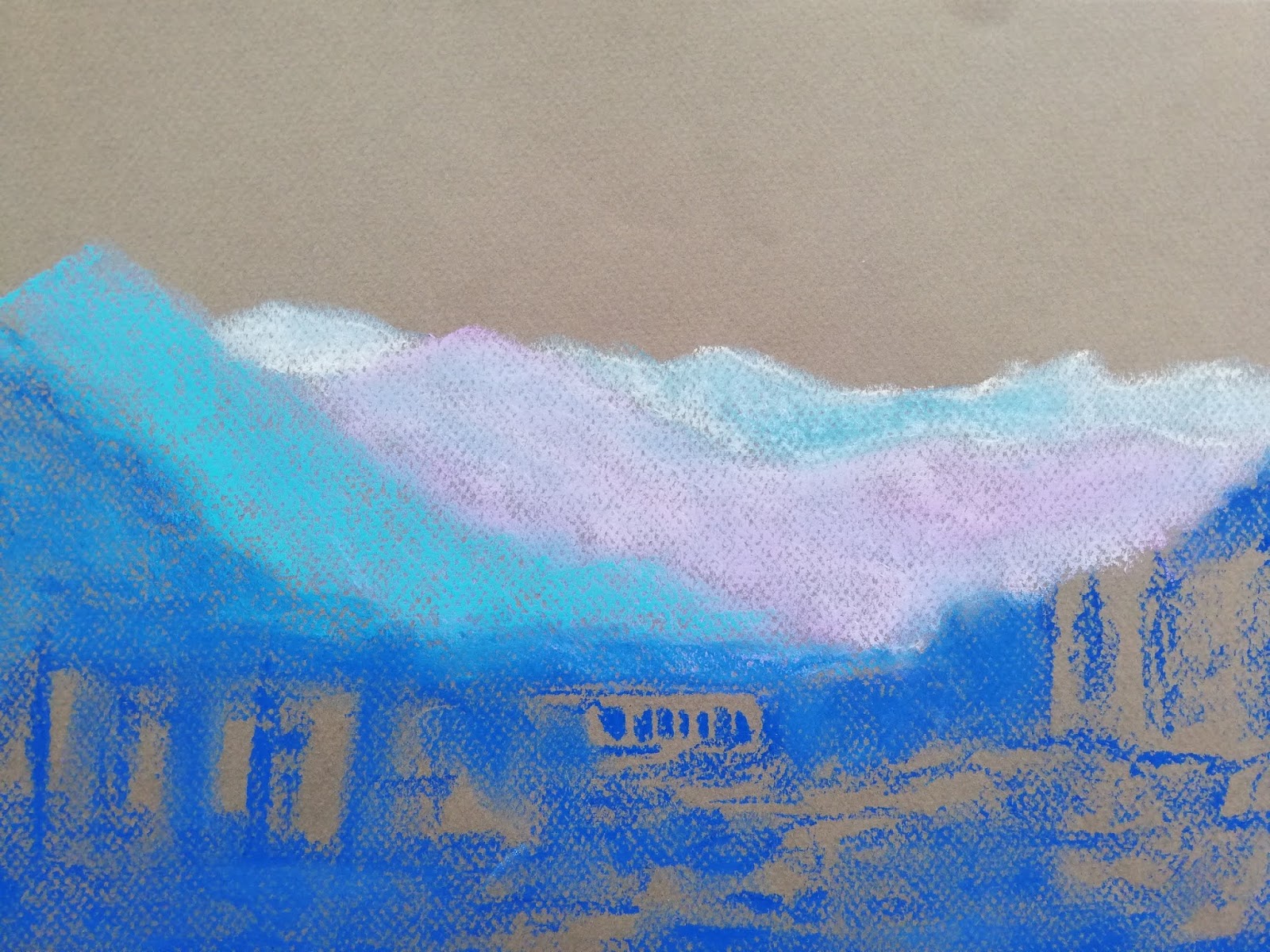
So I had another go at it. Better result. What I saw was that each material lends itself to its own handling and mark making. Using pastels requires a completely different handling to watercolor or charcoal.


Comments

Popular posts from this blog

Section 3: COMPOSITION. Research Point.

Contemporary Artists working with landscape and a range of viewpoints. Georges Seurat, Landscape with houses. 1881. Conte Crayon Tacita Dean, Fatigues. 2012. Chalk on Blackboard Mark Tansy, Reveler, 2012. Oil on canvas. The subjects of Mark Tansey's work is set in, for the most part, landscapes and he uses and manipulates these to serve the purpose of the allegory that he wishes to convey through the use of images which are paradoxical and at times absurdly but never, randomly placed on the canvas. I love his work and have included it here to compare the three works as they all monochromatic and unusual to their approach in viewpoint. In all three works there is a strong sense of division in the picture plane. The first two the space is divided horizontally and in the last vertically - Tansey's work has a strong sense of symmetry, both vertically and horizontally and this further emphasised by the repetition of this element in the mirror. Tonally the works are also...

Section 3: PERSPECTIVE. Exercise 2

As the weather continued to be rainy and wet, and as I did not want to work from a photo, I did a drawing of the buildings below my flat as seen from the 29th floor. This obviously changed the angle on the perspective and the horizon line. Using my pencil as a guide I checked the angles and proportions against those that I drew. As you can perhaps see, the horizon line was probably higher than what I thought it was .. some of the orthogonal lines were off... 

Section 2: STILL LIFE: Exercise 2: Still life using Tone and Color

I did 2 completed studies for this exercise. The first is in chalk pastels on a dark ground. I thought that the dark ground was useful in contrasting the light areas but that the medium is more difficult to control. I also felt that the composition was successful and I enjoy the contrasting rectangular spaces which off-set the round shapes of the bottles and fruit.   The second work was rendered in watercolour pencils and I felt that the medium was far more conducive to accurately capturing the variations in tone and colour. Overall I was more pleased with the first composition as it seemed a bit more interesting and dramatic in a sense.