The works of the Impressionist, Monet and the Post-impressionist, Cezanne are familiar to me and I admire and respect both these artists. Cezanne made multiple studies of Mount Saint Victoire and Monet did the same with his beloved lily pond. I think there is a lot to be said for revisiting a subject.
With David Hockney I feel that his landscape work is garish and uninmaginative and that the only redeeming factor in some of them is their immense size. Apologies if I have offended any Brit who reads this and feels I have judged him harshly. I honestly feel that there is nothing original about it.
Not so, Peter Doig.
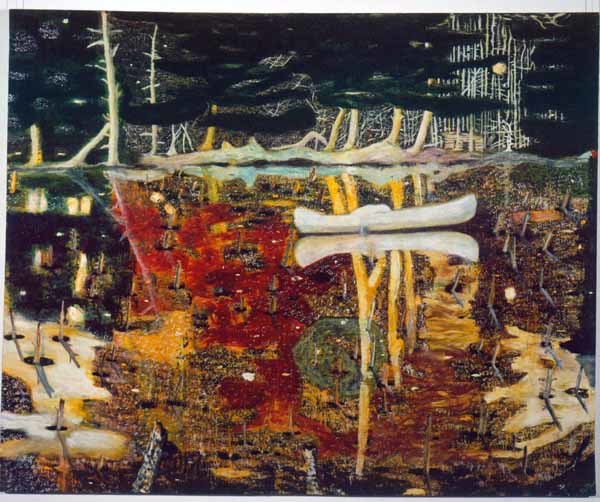
Peter Doig, Swamped. 1990
I absolutely love the multi layers of color, the sense of movement and the rich textural application of paint.

Peter Doig. Daytime Astronomy (Grasshopper). 2018
Perhaps it is the very unfinished feeling, the vagueness of his landscapes that make me want to walk into them and just live there for a while. For example in Daytime Astonomy, the green of the pond/river/swamp is just so emerald and deep you wonder how it would be just to dive into it. There is a rich enjoyable quality of his work that makes me think he loves to paint.
New to me is John Virtue's work and I love it.

John Virtue. Landscape no.739. 1947.
He captures a mood, a smouldering heaviness in his landscapes which make them appealing in a dark mystery novel kind of way. His work feels almost tactile as if it would be good to touch and I love the vague blended and dusty look that he achieves with both acrylic and charcoal.
Nicholas Herbert's work is vaguely reminiscent of some of Turner's work - the soft ones that have similar colours such as Norham Castle, Sunrise. (see below)

Nicholas Herbert. Landscape L947. 2017
His works are so vague that they are almost abstract, soft, blended and almost monochromatic they also give a strong sense of atmosphere and of weather than be strong reflections of place, and yet they do hold that.

JMW Turner. Norham Castle, Sunrise.1845
With David Hockney I feel that his landscape work is garish and uninmaginative and that the only redeeming factor in some of them is their immense size. Apologies if I have offended any Brit who reads this and feels I have judged him harshly. I honestly feel that there is nothing original about it.
Not so, Peter Doig.
Peter Doig, Swamped. 1990
I absolutely love the multi layers of color, the sense of movement and the rich textural application of paint.
Peter Doig. Daytime Astronomy (Grasshopper). 2018
Perhaps it is the very unfinished feeling, the vagueness of his landscapes that make me want to walk into them and just live there for a while. For example in Daytime Astonomy, the green of the pond/river/swamp is just so emerald and deep you wonder how it would be just to dive into it. There is a rich enjoyable quality of his work that makes me think he loves to paint.
New to me is John Virtue's work and I love it.
John Virtue. Landscape no.739. 1947.
He captures a mood, a smouldering heaviness in his landscapes which make them appealing in a dark mystery novel kind of way. His work feels almost tactile as if it would be good to touch and I love the vague blended and dusty look that he achieves with both acrylic and charcoal.
Nicholas Herbert's work is vaguely reminiscent of some of Turner's work - the soft ones that have similar colours such as Norham Castle, Sunrise. (see below)
Nicholas Herbert. Landscape L947. 2017
His works are so vague that they are almost abstract, soft, blended and almost monochromatic they also give a strong sense of atmosphere and of weather than be strong reflections of place, and yet they do hold that.
JMW Turner. Norham Castle, Sunrise.1845
Comments
Post a Comment